Printing in Color Part 2: Strange Photographs
May 3, 2012 Leave a comment
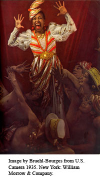
 The image at the top of this post contains photos made using Dufaycolor film, and Finlay Color film. The two images were printed on the front and back of the same piece of paper, which means they were most likely printed on the same press with the same inks. If this is so, then all of the differences in light and feel of the images were caused by the differences in the two films used.

In the early years of the twentieth century, producing a good color photo was tricky. One process popular in the 1930s and 40s, Carbro color, required “more than eighty different steps” to process (Sipley, 101). Kodachrome color, which went on the market in 1938, (Pollack, 511) resulted in violent oranges. Anseco Color film was blue-green, and Ektachrome film produced weak, orangish reds (Sipley, 164).
To print in four colors, the full range of light bouncing off of an object has to be divided. For instance, you need only the magenta part of the spectrum to be printed on the plate being inked in magenta. Before widespread use of the computer in the printing industry, the way to achieve three color negatives for cyan, magenta and yellow plates, was to photograph whatever you were printing through filters. Shooting through a blue filter would give you a negative to print the yellows, green filter would produce a negative for the magenta, the red filter for the cyan (Benson, 190).
One would think that shooting separation negatives directly from the subject would create less distortion of color than using an already distorted photograph as the starting point. But most separations were made from a flat original, because setting up people and still lifes in front of the camera presented its own problems. It only worked if the people did not move at all while the photographer was changing out the plates and filters for each separation negative. Also, because light had to get through a filter, and sometimes a half-tone screen, good negatives required a lot of light.  At the beginning of the twentieth century, the Colorplate Engraving Company of New York City made its separations on the roof (Sipley, 41). Even if the photographers could get three solid, correct separations for the cyan, magenta, and yellow inks, how much information to leave in the black layer, was left to the discretion of the cameraman and the printer (Hymes, 50). This might account for how dark some early photo-engravings seem.
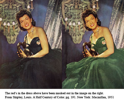
If the separations came out dark, or greenish, printers could alter the separation negatives by hand, or use plastic transparencies called Colatones (Sipley, 191). Hand alterations could not have the delicacy of digital alterations. In the image just above and at right, the model’s dress in the masked image looks like it has dropped out of an entirely different world than the rest of the photo.
 I would love to read a book on how to identify the film used in a printed photo just by looking at it. If anyone knows of one, please let me know.
I have larger versions of these images and the images from my earlier post on printing in color on Flickr here.
- Benson, Richard.”The Printed Picture.” New York : Museum of Modern Art :Distributed by Distributed Art Publishers, c2008.
- Hymes, David G. “Production in Advertising”. New York: Colton Press Inc., 1950.
- Pollack, Peter, “The Picture History of Photography.” New York: Harry N. Abrams Inc., 1958.
- Sipley, Louis. “A Half Century of Color” . New York: Macmillan, 1951.


