Customer Service versus The Catalog

Image

I took a temporary and part-time job at the Bank Street Bookstore. I wanted to know if there were essential differences in the way Bank Street moved books through the door and the way the Cooper Library performed the same task.

The store, which is owned by the Bank Street College of Education, is around 16’ x 36’ on the ground floor and maybe twice as large on the 2nd floor, by a rough eyeball measurement. The walls are lined with books, games, art supplies and toys. Maybe 13-15 people work at the store, stocking, working the cash-register, taking care of orders and helping find books for customers.

It is in this task, finding books for customers, that Bank Street is essentially different from Cooper Library. At Cooper, the librarians and staff are instructed to show patrons how to find a book and then back off and let the patron find it for themselves. Bank Street Bookstore is all about personally selling the book to the patrons. It is often not even possible for a patron to find a book without aid.

Several things allow a library patron to find a book: an online catalog which tells whether a book is available, a call number system which suggests where the book will be located, a cohesive shelf layout, signs and maps so that the patron can find where that call number should be. None of these clues are available to the patrons at Bank Street. The books are divided into sections based on subject matter, binding and intended audience. the physical location of each of these sections is dictated by demand, space, and line of sight. When I started working there, the store had little signage because the new manager had just moved many of the sections. There are no maps of the bookstore. The catalog of the bookstore is not available online, and there are no public computer terminals to provide access to the public.

Access to the catalog would not help bookstore patrons much anyway because the catalog does not have the robust search capabilities library workers expect. Searchers can not use more than three keywords, and there is no way to use multiple fields in the same search. Because the system has to use the college’s overworked servers, 20-60 second lags are common. The system does not need to be simple, fast, or self-explanatory because only highly trained staff will ever use it.

However frustrating this system was to a new hire, the experienced staff make it all work beautifully well. They offer each patron what they can’t get anywhere else: book recommendations tailored to their child’s needs and tastes. The staff memorize the subject matter, title and author of hundreds of children’s books. When galleys come into the store, the staff read them to get a sense of each book. Amazon provides easy searching.  Bank Street provides personal aid and interest.

Readers advisory and recommendation is not something the Cooper librarians or staff do. This is not to say that we don’t occasionally recommend books, but there is a general feeling that college students are the best judge of which books would suit their own research needs. I have only once been asked for a general book recommendation at the reference desk. However there is one thing that the Cooper librarians could do to engage users: simply greet them as they came through the door and ask if we can help with anything. It might give the users more of a sense that the reference librarian is tuned in and ready to help.

I really enjoyed working at Bank Street. It made me feel humble and made me think.

Also, why don’t bookstores have publicly available catalogs? Even the Strand, which has a great catalog, has no computers for patrons to use.

Photo tour of Bank Street Bookstore by Publishers Weekly

Printing in Color Part 2: Strange Photographs

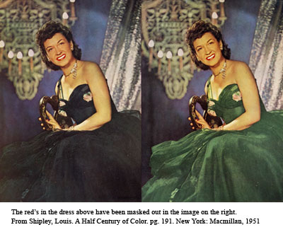
Finlay color and DufayColor side by sideThe image at the top of this post contains photos made using Dufaycolor film, and Finlay Color film. The two images were printed on the front and back of the same piece of paper, which means they were most likely printed on the same press with the same inks. If this is so, then all of the differences in light and feel of the images were caused by the differences in the two films used.

In the early years of the twentieth century, producing a good color photo was tricky. One process popular in the 1930s and 40s, Carbro color, required “more than eighty different steps” to process (Sipley, 101). Kodachrome color, which went on the market in 1938, (Pollack, 511) resulted in violent oranges. Anseco Color film was blue-green, and Ektachrome film produced weak, orangish reds (Sipley, 164).
To print in four colors, the full range of light bouncing off of an object has to be divided. For instance, you need only the magenta part of the spectrum to be printed on the plate being inked in magenta. Before widespread use of the computer in the printing industry, the way to achieve three color negatives for cyan, magenta and yellow plates, was to photograph whatever you were printing through filters. Shooting through a blue filter would give you a negative to print the yellows, green filter would produce a negative for the magenta, the red filter for the cyan (Benson, 190).

One would think that shooting separation negatives directly from the subject would create less distortion of color than using an already distorted photograph as the starting point. But most separations were made from a flat original, because setting up people and still lifes in front of the camera presented its own problems. It only worked if the people did not move at all while the photographer was changing out the plates and filters for each separation negative. Also, because light had to get through a filter, and sometimes a half-tone screen, good negatives required a lot of light. At the beginning of the twentieth century, the Colorplate Engraving Company of New York City made its separations on the roof (Sipley, 41). Even if the photographers could get three solid, correct separations for the cyan, magenta, and yellow inks, how much information to leave in the black layer, was left to the discretion of the cameraman and the printer (Hymes, 50). This might account for how dark some early photo-engravings seem.

If the separations came out dark, or greenish, printers could alter the separation negatives by hand, or use plastic transparencies called Colatones (Sipley, 191). Hand alterations could not have the delicacy of digital alterations. In the image just above and at right, the model’s dress in the masked image looks like it has dropped out of an entirely different world than the rest of the photo.

I would love to read a book on how to identify the film used in a printed photo just by looking at it. If anyone knows of one, please let me know.

I have larger versions of these images and the images from my earlier post on printing in color on Flickr here.

  •  Benson, Richard.”The Printed Picture.” New York : Museum of Modern  Art :Distributed by Distributed Art Publishers, c2008.
  •  Hymes, David G. “Production in Advertising”. New York: Colton Press   Inc., 1950.
  •  Pollack, Peter, “The Picture History of Photography.” New York:   Harry  N. Abrams Inc., 1958.
  •  Sipley, Louis. “A Half Century of Color” . New York: Macmillan, 1951.

Printing in Color

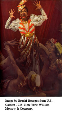
The color printing in old periodicals looks different from the printing in modern magazines. High end works from the thirties, such as the prints in Westvaco or Gebrauchsgraphik, contain greens and purples that glow. The ads in Life magazine from the forties show greyish hams and bright pink complections. A large proportion of the ads in magazines before the 1970’s include only one color if they include color at all.

What changes accounted for the differences in printed color images in the first half of the twentieth century? The simple answer is that printed images were produced using different printing methods, inks and originals. The complex answer is a maze of chemical interactions, color theory and economics. In this short post I will touch on only the subject of the inks used. A later post will cover the photographs in early commercial color printing. For a more in depth look at the printing industry, I recommend Louis Walton Sipley’s “A Half Century of Color”.

Inks

Since the 1970s, most magazines have been printed on offset lithographic web-presses. A roll of paper is run through a set of four to six sets of ink rollers. Each roller set includes a flexible metal plate, a rubber “blanket” which picks up the ink from the plate, and the paper which picks up the ink from the blanket (Benson, 256). The inks are quickly dried before passing on to the next set of rollers. The four colors of ink used in these sets of ink rollers are usually cyan, magenta, yellow and black. Occasionally, a high end client will ask for a fifth or sixth color, called a “spot color” if they can’t get the wealth of hues they need out of the normal CMYK inks. Because the “spot color” is a custom job, it can be very expensive.

I want to emphasize that with the web press set up, any page that requires any color, passes through four sets of rollers, whether it needs four colors or not. Moreover, to produce one ad that does not use the standard CMYK color scheme would require wiping down the ink rollers and adding a different set of inks to the rollers, a process that would take time and money. Under such circumstances, the overwhelming majority of ads in magazines these days are printed in CMYK.

CMYK did not always have such a hold on the color printing system. As late as 1927, it was believed that adding two printing inks over each other in rapid succession would necessarily distort an image (Sipley, 67). Each color page was run through the press as many times as there were inks that needed to be added. By 1951, two color presses were common and cheap (Sipley 129). This still meant that if you wanted color, your ad had to be individually run through the press once for two colors, and twice for four colors. If you had to pay to add some color ink to three rollers anyway, why not use the pink, orange and blue ink that would make your image really stand out?

Partly because of the prevalence of two color presses, using only two colors of ink was very common, especially in specialized magazines which would reach a smaller audience. (Biggs, 73). In 1956, because the plate for each ink was hand altered, fewer colors meant less cost (Biggs, 82). Good designers turned the limitation to their advantage, creating some bold and minimal designs.


Fun images of color printing:

Women from 1930’s Japan

George Eastman House color prints by Nickolas Muray

Works Cited:

Benson, Richard. “The Printed Picture.” New York : Museum of Modern Art, c2008.

Biggs, Ernest. “Colour in Advertising”. New York: Studio Publications Inc., 1956.

Hymes, David G. “Production in Advertising”. New York: Colton Press Inc., 1950.

Pollack, Peter, “The Picture History of Photography.” New York: Harry N. Abrams Inc., 1958.

Images Ripe for Reuse

At a lecture at the Brooklyn museum called “Transnationalism and Women Artists in Diaspora”, I had a thought about the value of art libraries to an artist. To really serve artists, an art library should include not only examples of fine art, but also other sorts of visual material.

The transnationalism panel consisted of eight women speakers, but only five talked at any length; the working artists Kira Greene and Chitra Ganesh, the two curators Yasmin Ramirez and Yulia Tikhonova, and the collector Abena Busia. They spoke of several themes, nostalgia for a lost homeland, the body as the battle ground for cultural expression, and how sewing and fabric is related to ideas of femininity.

One theme kept coming up: transcending cultural boundaries. In visual terms, this was expressed as found images which were recontextualized. Kira Greene uses wall-paper patterns, fabric patterns and still-lifes inspired by cook-books. She intertwines and layers the images to express a fusion of different cultures, arts and times. Chitra Ganesh uses Amar Chitra Katha comics and the space of 15th century northern european paintings to resurrect subconscious narratives and eroticism which transcend cultural barriers. Some of the artists mentioned by the curator Yasmin Ramirez also recontextualize images. Firelei Baez uses china patterns and BBW images. Nicole Awai uses nail-polish sample patterns and hardware drawings.

The idea that artists “borrow” images is hardly new. Just look at discussions of the influences in Cypriotic art. I also included an image from The Hundred Headless Woman” for a look at how Max Ernst used found imagery. I suspect, but cannot prove, that through the internet and globalization, artistic borrowing of imagery is more and more common. What interested me was the realization that much of this imagery would not be considered high art. Comics, wallpaper and china patterns are the decorative milieu of everyday life, rather than the crystallization of an idea as good paintings purport to be.
So I return to my original, rather elementary idea. It is good if an art library includes not only examples of fine art, but also other forms of visual media: pattern books, old travel narratives, comics, ads, posters, maps, menus, snapshots and scrap-books.

Obviously artists use the internet for most of their photo references. This does not lessen the importance of print resources. We are all used to having disconnected images thrown at us. Ads proclaim the importance of Mr. Clean, or mint flavored dental floss. Twitpics and facebook links combine the visual flotsam of many different minds into one stream. Users are quite capable of adding in some print images that they have chosen for themselves. Books and magazines can also add a unique context to images because the images are bound in place by the creator, portraying the creator’s vision of how each item is situated in relation to each other item.

With a tight library budget, using money on fugitive, undervalued material seems unwise. However, most of this image matter is cheap, or free. Perhaps allocating the odd dollar towards a book on a collection of comics or stamps would not go amiss. A book on historic playing cards at the Cooper Union is very popular. Even if the material can be gotten for free, making it available to users presents other problems. Picture collections might be a low-effort way of adding material to the collection. At the very least, the popularity of found material provides an argument for keeping these bits of popular culture if they are already in a library.

Notes from a Bibliographic Instruction meeting.

There were four presenters at the Metro Bibliographic Instruction Special Interest Group meeting on March 12th: Elaine Maldonado from the FIT Center for Excellence in Teaching, Jennifer Yao from Gimbel Library, Darcy Gervasio from Purchase College Library, and Frederick Lopez from St. Francis College Library. Each presenter stood at a podium before the group of library professionals and gave a 20-30 minute presentation, accompanied by Powerpoint slides. The subject of the lectures was how to improve library instruction.

Elaine Maldonado started off the presentations. She pointed out what teachers should not do such as: dump a load of information on a student all at once, simply stick to the lecture model that our teachers used on us, even lightly shame a student, or lean too much on technology. She reminded us that students are often smarter than the teacher and we need to teach students the tools to learn as well as the information itself.
Ms. Maldonado then emphasized the importance of getting the students involved in the process of learning. She said that students retain more information through peer-to-peer interactions, performing a process themselves, or performing an activity. Lectures should be very short, librarians should use different strategies during each class, and assess each class with improvements in mind.

Jenny Yao offered tips and strategies that she had picked up from years of library instruction sessions. Her presentation dovetailed nicely with the earlier lecture by Ms. Maldonado, since Ms. Yao gave real world examples of some of the strategies that the earlier presenter advocated. Of particular interest to me were the activities she developed and tested. She divides the class into three teams and plays a version of Jeopardy with library categories, such as “Faq’s and “the Catalog”. The game was built in Powerpoint. She also presented a handout which asked students to go through the task of finding a journal, reading the first page, and answering a question.

Darcy Gervasio began her presentation on technological disasters with her own war story. In a presentation in library school on Refworks and Zotero, the internet went out. She reversed the order of her presentation and talked about adding citations to a bibliography first, since the demonstration bibliography was stored on her computer. She advised librarians not to panic if anything goes wrong and to think about alternatives. If the catalog goes down, use Worldcat instead. If the internet goes down, take the class on a library tour, use print sources, or ask everyone to use their smart-phone. Gervasio also advised that before the class we have a backup plan ready.

Frederick Lopez gave the last presentation, which was about how to deal with disruptive students. Many of his strategies would work better for teachers who saw students more often than once a semester. His idea of asking the students who come last to sit in the front of the class I thought was brilliant. It would get the students who may be slightly less engaged up at the front of the room without obviously penalizing their tardiness. He advised that if a student is falling asleep you can call on them to answer a question that they will probably be able to answer correctly. He also asked librarians to remember to listen to their problematic students and try to engage them in exercises.

The presenters practice what they teach. The powerpoint presentations were colorful and well illustrated. Ms. Gervasio engaged her listeners by asking for technology disaster stories. Each was careful to ask whether everyone in the class could hear her. Dividing the meeting into four short presentations broke up the time, and made it easier to concentrate and learn.

For the next class that I teach I think that I need to:

  • Ask the students what they want to learn. (Maybe through the teacher before class.)
  • Further limit the amount of time that I spend lecturing.
  • Ask the students to go through a search for themselves.
  • Ask who in the class knows the material and ask that they demonstrate.
  • Think about new activities such as jeopardy.
  • Come up with a plan in case technology fails me.
  • Bring some print periodicals to class.
  • See if I can’t record myself teaching.

How Much Peer Review is Peer Review?

An article in the Chronicle of Higher Education examines the dubious peer review and submission process for the free online journals owned by the OMICS company. The company charged between $900 and $3,600 for each submission, and posted unfinished versions of papers with formatting errors and typos. Though some of the papers published by OMICS were received well by the scholarly community, others are of doubtful scholarly merit; OMICS published a paper explaining that Stonehenge was an early warning sign of the disease in the earth which is now causing global warming. The company recruits its professional reviewers through mass-emails and leaves the review process largely up to each reviewer. A few of the reviewers contacted by the Chronicle were unaware they were supposedly on the editorial board of an OMICS journal.

Recently, the online open access journal PLoS One was publicly criticised by a professor in an article for Psychology Today. He said the journal “obviously does not receive the usual high scientific journal standards of peer-review scrutiny”(Bargh), because the journal charges a hefty fee, and does not limit publication to only the very best of their submissions, but instead uses their peer-review editorial board to make sure the articles are “technically sound” and objective. The critics own objectivity is in question because he is criticising PLoS for  publishing an article contradicting one of his own findings. The PLoS publisher responded to the criticism here.

All of this raises questions in my mind about what the peer-review process actually entails, and how much faith to place in the process. Qualified reviewers are hard to come by and when you do find them, they are often extremely busy people (Sieber). Peer review can perpetuates the status quo at the expense of innovation (Fitzpatrick).  David Ozonoff says in a Nature debate that even extremely well qualified peer-review editors sometimes need a statistician to look over large chunks of data. Good statisticians are expensive to employ, busy and scarce. A peer-reviewer also should be sympathetic to the author’s “theoretical/ disciplinary framework” or the paper could be rejected without due cause (Berkenkotter, 246). The details of how a peer-review process operates seems to vary from journal to journal. The process is largely closed to public scrutiny, giving no indication of why articles were chosen for publication, or if the editors had any reservations about the content (Fitzpatrick). Since the process is so secret, reviewers can steal or suppress ideas (Resnik). The peer-review process can take months, a real problem for time sensitive materials (Stratford). Innovative online papers get a rigorous, public critique on the web even without peer-review .

For me, all of this does not add up to a compelling argument against peer-review. Peer review is just too useful as an information filtering tool in this digital environment. Once, a student could only access content published in journals. The peer-review process actually cut down on the amount of information available. Now, a researcher can see all of the un-peer-reviewed scholarship pretty easily with a little help from Google. Peer-review is just one more indicator that information is legitimate, an industry’s gold-seal of approval. Problems arise only if students, researchers, or those with the power to award tenure take peer-review as the only criteria for assessing the legitimacy of information.

I checked the definition of peer-reviewed material with Ebscohost and Galegroup, two of Cooper Union Library’s largest suppliers of article databases. Both allow the user to limit results to “peer-reviewed” content, a very useful feature for students restricted by their teachers to only peer-reviewed sources. The definitions were pretty elastic. Galegroup conflates “peer-reviewed” with “refereed”. Ebscohost’s definition is a little more rigorous, as one would expect. However, Ebscohost does include journals whose reviewers are aware, and journals whose reviewers are unaware, of an author’s identity. It also includes journals with external and journals with internal,  editors.

All this boils down to one conclusion for me: I should, occasionally, remind students during instruction sessions to evaluate their sources, even if their information comes from a peer-reviewed source.

Roll, Jordan, Roll part 2: Ulmann and Peterkin

Here is a little background information on Julia Peterkin and Doris Ulmann. The two woman seem to have come to the collaboration that resulted in Roll, Jordan, Roll with different goals.

Doris Ulmann
Doris Ullmann was a well-off woman of Jewish descent and humanist upbringing who lived in New York. (Jacobs, 3). She studied under Clarence White, and her work was associated with Pictorialists such as Stieglitz and Steichen. (Jacobs, 88). She got her start photographing intellectuals in New York,  but it was as a photographer of the rural poor that she became famous, and found her passion. (Jacobs, 74)

I thought that the poverty and manual pursuits of the subjects in Roll, Jordan, Roll were an indication of racism in Ulmann. After all, southern black farmers were beginning to head up north to find better work, but these migrants do not appear in Roll, Jordan Roll. (Newhall, 26).  However, race had little to do with the choice of sitters. Ulmann had been trying to find a particular sort of American rural “type” since 1925, and this type had little to do with race.  She photographed Shakers, Dunkards, Mennonites, and the craftsmen of Appalachia, but also Native Americans and, obviously, Southern blacks (Jacobs, 55).  Perhaps she was responding to the ideas instilled in her during her elementary and college education under Felix Adler at the Ethical Culture School in Manhattan. (Newhall, 28). Adler taught that “there is such a thing as national character, national genius, or national individuality.” (Adler, 98).  Perhaps Ulmann sought to capture what was best in America. She may have also been responding to a perception in the 1930’s that rural communities were being squeezed out by increasing mechanization (Collins, 55). There may have been a certain paternalistic and nostalgic slant to Ulmann’s choice of sitters, but it was to her credit, I think, that she did not define her ideas of rural Americans using color lines.

In the images from Handicrafts of the Southern Highlands, white Appalachian basket weavers, potters and musicians are also shown engaged in tasks which do not require literacy, and wearing rather picturesque work clothes. Her choice to concentrate on some of the more marginal members of Gullah society can be explained by Ulmann’s  need for interesting faces, rather than a wish to portray the Gullah as a subject people. She wrote: “a face that has the marks of having lived intensely, that expresses some phase of life, some dominant quality or intellectual power, constitutes for me an interesting face. (Jacobs, 86)

The individualism Ulmann shows in the portraits for Roll, Jordan, Roll was also a motif to be found in all of her work, and not a response to the race of her photographic subject. She wrote: “Whenever I am working on a portrait, I try to know the individuality or real character of my sitter and, by understanding him, succeed in making him think of the things that are of vital interest to him. (Jacobs, 85). Though she said that working with the African-Americans in South Carolina was “difficult”, because they were so “strange” and “self-conscious”(Jacobs, 64), she told stories to elicit responses from her black sitters as she said was her usual way of working. One of her black sitters, a man named Dale Warren, said Ulmann would tell “a funny story to make you laugh and another not so funny to see if you are easily reduced to tears”(Newhall, 28).

Julia Mood Peterkin
Julia Mood Peterkin was a rich woman from South Carolina. Her mother died when she was very young, and she was raised by a Gullah nursemaid. In 1903, she married the plantation owner William Peterkin and moved to his 15 hundred acre cotton plantation called Lang Syne (Jacobs, 62). In the early years of her marriage, her Gullah servants were some of her closest friends (Williams, 17). She used real events in the lives of the workers on Lang Syne as the seeds for growing her stories (Williams, 19). She felt stifled playing the role of the good southern woman, and she referred to the day that she was discovered as a writer as her true birthday (Williams, 30).

She published four novels and numerous shorter works about southern black culture before she began work on Roll, Jordan, Roll. One of the four novels, Scarlet Sister Mary, received a Pulitzer Prize in 1932 (Durbam, 34). The characters in the novels are passionate individuals and representatives of a fierce fight for survival (Kriedel, 470). She told stories of abortions and cruelty when no one else would. Though a few of her short works included harsh criticism of the double standard applied to blacks and whites (Williams, 51), the novels are told through Gullah characters, and include little mention of whites at all (Newhall, 26). Peterkin stated that she meant “to present these people in a patient struggle with fate, and not in any race conflict at all” (Kreidler, 468).

Roll, Jordan, Roll was a departure from this established formula of how to craft a book. As I mentioned in my earlier post, Roll, Jordan, Roll is a mix of third and first person narrative with anecdotes and superstitions thrown in, a mix Peterkin was not comfortable with. In a letter to a friend she wrote: “my chief worry is [the book’s] lack of form with sketches mixed together in dangerous confusion” (Jacobs, 126). She was right to worry. The most egregiously paternalistic passages of Roll, Jordan, Roll are those in which she describes the plantation and its history. By keeping herself and all whites out of her novels, Peterkin avoided her own compromised position as a plantation mistress. In the initial chapter of Roll, Jordan, Roll she has to speak with her own voice about her home of thirty years, Lang Syne. The result seems nostalgic and deluded.

In 1925 Peterkin wrote a novel from the view point of a white plantation mistress (Williams, 89). The result was the confusing and contradictory work called On the Plantation. When Peterkin asked H. L. Mencken how to fix the work, he advised her to “take out the white woman” (Williams, 95). On the Plantation sans white woman became the powerful novel Black April. Apparently, Peterkin’s position as white plantation mistress was too contradictory for her to address it with lucidity or strength.

The more I read about the making of Roll, Jordan, Roll, the more interesting the viewpoints of its two authors became. Both woman had contradictory opinions about their subjects, hardly surprising from artist approaching issues of race. Perhaps the primary difference between the tone of the images in Roll, Jordan Roll, and the tone of the text, is that Ulmann could keep herself behind the camera while Peterkin revealed to much.

  • Adler, Felix. “The Moral Instruction of Children.” New York: D. Appleton & Co., Publishers, 1892. Project Gutenberg. Web. 7 Mar. 2012. URL: http://www.gutenberg.org/catalog/world/readfile?fk_files=2363349
  • Collins, Lisa Gail. “Visualizing Culture: Art and the Sea Islands.” International Review of African American Art. 19.1 (2003): 54-59.
  • Durbam, Frank. “The Reputed Demises of Uncle Tom; Or, the Treatment of the Negro in Fiction by White Southern Authors in the 1920’s.”  The Southern Literary Journal. 2.2 (Spring, 1970): 26-50. JStor. Web. 16 Mar. 2012. URL: http://www.jstor.org/stable/20077383
  • Eaton, Allen H. “Handicrafts of the Southern Highlands.” New York: Russell Sage foundation, 1937.
  • Jacobs, Philip Walker. The Life and Photography of Doris Ulmann. Lexington, Kentucky: University Press of Kentucky, 2001.
  • Kreidler, Jan. “Reviving Julia Peterkin as a Trickster Writer”. Journal of American Culture. 29.4 (Dec. 2006): 468-474.  Ebscohost Omnifile. Web. 7 Mar. 2012.
  • Lamuniere, Michelle C., “Roll, Jordan, Roll and the Gullah Photographs of Doris Ulmann.” History of Photography. 21.4. (Wint. 1997): 294-302.
  • Newhall, Beaumont. “Photographing America’s South: Roll, Jordon roll.” Artonview. No.58 (Wint. 2009). Web. Ebscohost Omnifile. 7 Mar. 2012.
  • Williams, Susan Millar. “A Devil and a Good Woman Too: The lives of Julia Peterkin.” Athens, Georgia: University of Georgia Press, 1997.

Roll, Jordan, Roll part 1

I encountered the Cooper Union Library’s copy of  Roll, Jordan, Roll when I was selecting material for a small exhibit of photogravure works.

The title page proclaims the book to be: “Roll, Jordan, Roll: The Text by Julia Peterkin, The Photographic Studies By Doris Ulmann, New York: Robert O. Ballou , Publisher”. A colophon at the back of the book adds that this is a special edition of 350 copies of Roll, Jordan, Roll, each signed by Doris Ulmann and Julia Peterkin. The Letterpress was done by the Maple Press Company,  the photogravures by the Photogravure and Colour Company, and the binding by J. F. Tapley Co.

Physically the book is beautiful. It is 341 pages long and, despite being over 80 years old, the paper is still strong and flexible. Though it has a yellow cast to it, I am inclined to think this is the paper’s original color, and not the result of acid, since the color is only slightly concentrated along the edges of each leaf. The text is large, probably around 14pts, and the margins are equally extravagant. Our copy has been rebound but the the signatures are intact and tight.

Despite the beautiful paper and printing, it is the book’s photogravure illustrations which really catch the eye. There are 87 photogravures from the 1930s of black women, men and children, mostly working. The photogravure process allows the grays to shade seamlessly into the luminous shadows. In the wide margins of the pages the indent of the printing plate can be seen framing each image.

When I first picked up the book, I wondered whether Doris Ulmann might not have been black, like her subjects, since I thought the photos were surprisingly sympathetic for an outsider photographing the “other”. All too often, photographers of black subjects allow shadow and the darkness of the skin to obscure a persons face, making them a featureless symbol instead of an individual. Many of the people in Roll, Jordan, Roll have obscured faces, but most stand out in startling individuality, light, dark, old, young, poor and wealthy. Moreover, instead of blank expressions on which the viewer can project his own thoughts, the people look smug, happy, weary, worried, scared and suspicious. Many have their mouths open as if they are actively engaging with the viewer through speech.

Doris Ulmann seems to have used a short field of focus and a long shutter-speed. Children, fabric, and plants blur with motion. Foregrounds and backgrounds slide out of focus, centering the eye on the one face in the crowd that is perfectly captured. For me, this creates an instant connection between the viewer and the one in-focus individual. It mimics the way, in face-to-face meetings, the eye concentrates on the interesting person, and all the periphery slides into obscurity.

This is not to say that suggestions of racism don’t appear in the photographs. None of the people are engaged in tasks that require advanced study, or even literacy. There are pictures of manual laborers, church goers, convicts and servants, even a boot-black. There are no pictures of factory workers, artists, artisans, teachers, or industrialists. At least there are no pictures of minstrels. None of the subjects are named either, though this may be simply because the decision was made not to include captions on the photos. Names would have reinforced the point that the people pictured are individuals, and not simply a type.

The text written by Julia Peterkin is even more problematic. She begins the work with references to plantations and slavery. Nor does she mention any of the disruptive results of this past. She mentions how slaves were taught useful trades, how white children formed lasting relationships with their slaves, and how the descendants of slaves still look to white landowners to “protect them from injustice whenever the law threatens them with punishment” (17). She makes broad claims about the “negro way of thinking” (21). Dialog is written to accentuate the speaker’s accent. For instance on page 322, an unnamed narrator says: “Ev’y mornin since e had de book an de speech e gets up at first fowl crow to do all his task befo breakfast so e won’ be lated for school”. This may be an honest portrayal of the narrator’s accent, but we every one of us has an accent which betrays our origins. To deliberately write out an accent emphasizes this narrator’s separation from the reader and his lack of conventional education. Many of the people in the stories are never named at all. Others are only given first names or nicknames.

The writing does have its fascinations though. Julia Peterkin blends narrative and exposition, leaving the reader to wonder when one ends and the other begins. The stories contain references to long gone superstitions and holiday traditions. “A buzzard claw tied to a string around a baby’s neck will make the child nimble on its feet.” (237). Peterkin states this remedy as a fact, without giving any source. The reader is left to assume that this bit of exposition actually comes from a bit of narrative the author listened to. The blending makes all of the author’s words suspect, like the events in a dream. Descriptions are often evocative and lyrical, almost mystical.  “How pale and blue Maum Mary’s mouth looks beside its glossy scarlet! But the flies are wide awake. They swarm over the bush down into her face, humming, buzzing, dancing ” (142).

The author does try to redeems herself from a charge of racism with statements such as: “It is absurd to place all Negroes in one great social class, mark it “colored,” and make generalizations about its poverty, ignorance, immorality. Negro individuals differ in character and mentality as widely as do people with lighter skins.” (22) I am not sure such statements can negate the effect of the tone of the first chapter on slavery, or the slightly paternalistic tone of the writing.

A later post will contain a little about Julia Peterkin and Doris, Ulmann, especially as their histories touch on the creation of Roll, Jordan Roll.